Redwood Coast Seniors
Providing stimulating activities, essential services & programs for seniors.
Along with bright new leadership, facility upgrades, new delivery vans and an expanded staff, RCS was ready for an upgrade to their brand. Their logo, established around the organization’s conception, is steadfast and very recognizable.
Scope
Brand Strategy, Collateral Design, Signage, Web design
Brand Strategy
A welcoming community


RCS needed a major update to leave behind their aging reputation and become the happening place for seniors to gather. The community loved the center, but RCS didn’t have a clear vision to share or an inviting story seniors could get behind. We created a brand that was friendly and playful but also clean and professional with bright color palettes, easy to read text for our senior audience and pictures of seniors enjoying life together to make them feel this was a fun, welcoming place.
Logo Design
I heart RCS

RCS had a logo they treasured, but it wasn’t exhibiting the lighthearted playfulness they wanted to exude. Using their idea as a guide, we implemented the bright color palette and swirled the colors around the heart, adding movement and light. We paired this with an open, flowing font and created a mark that accentuated the active vibrancy of the center itself.
Year End Appeal
Standing out with bold color

Year end is when most non profits do their big push for donations, and because all appeals go out at the same time, it’s important to really stand out in mailboxes. To increase the likelihood that RCS’s appeal would be opened and not thrown directly into the trash, we created a bright envelope that would look unique against a sea of white. This approach paid off: RCS’s donations increased by 28% and garnered many comments from donors that this was the most striking appeal they’d seen from RCS in its 30 year history.
Website
Accessible and informative
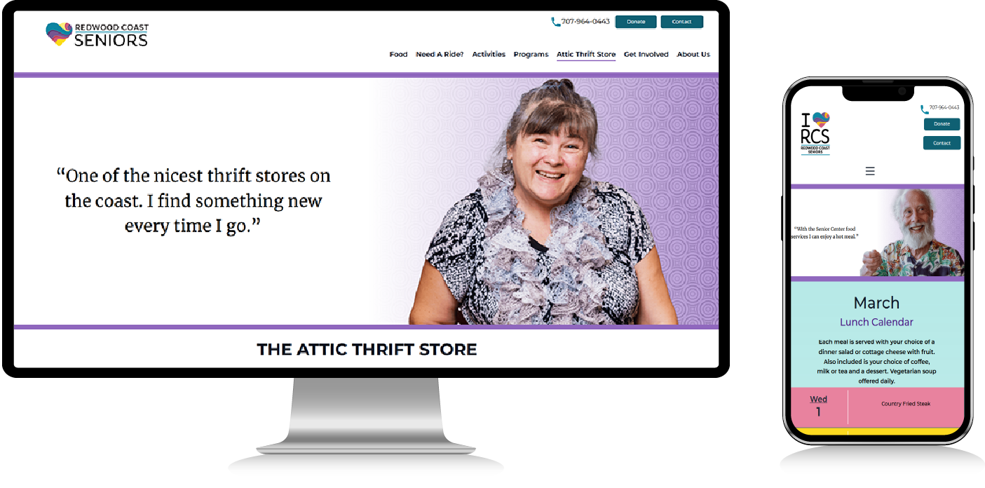
RCS had an outdated website with no consistent visual appeal and the overly complex menu system made it impossible for visitors to find information. Not to mention, the backend was costing the staff countless hours in lost productivity as they tried to navigate the outdated interface. We were tasked with creating a website with a simple navigation system that was easily accessible and beautifully presented. First, we identified the most important things people came to RCS for: Food, Transportation and Activities. Then, we built a site that highlighted those key areas. We created a calendar that clearly showed their lunch offerings and classes all in one place and connected it with their established system. The backend was created to their specific needs which reduced downtime and allowed for a faster transition from the old site. We also created a rich and varied photo library from on site photoshoots with actual clients of the center. The thought was: if people recognize their neighbor, they’re more likely to join in the fun too! The streamlined and updated website increased the volume of visitors coming through the door each day because now they could clearly see what the center was offering.
Collateral Design
Raising community awareness

Brochures and informational rack cards are a great way for RCS to get their programs and general information about the center out to the community. They raise awareness of their brand in the community as well as remind clients what RCS has to offer.
