What is a stylescape and why do you need one?
Web Design
Branding

Blog post by Aspen Logan
published 6/19/2024
What is a Stylescape?
In the world of design, clarity and effective communication are crucial. Enter the stylescape: a powerful tool that provides a tangible and comprehensive visual reference, bridging the gap between client ideas and designer interpretations. By establishing a shared visual language early on, stylescapes reduce misunderstandings, streamline the design process, and ensure the outcome aligns with the client’s goals and brand identity. But what exactly is a stylescape, and why is it indispensable?
The Essence of a Stylescape
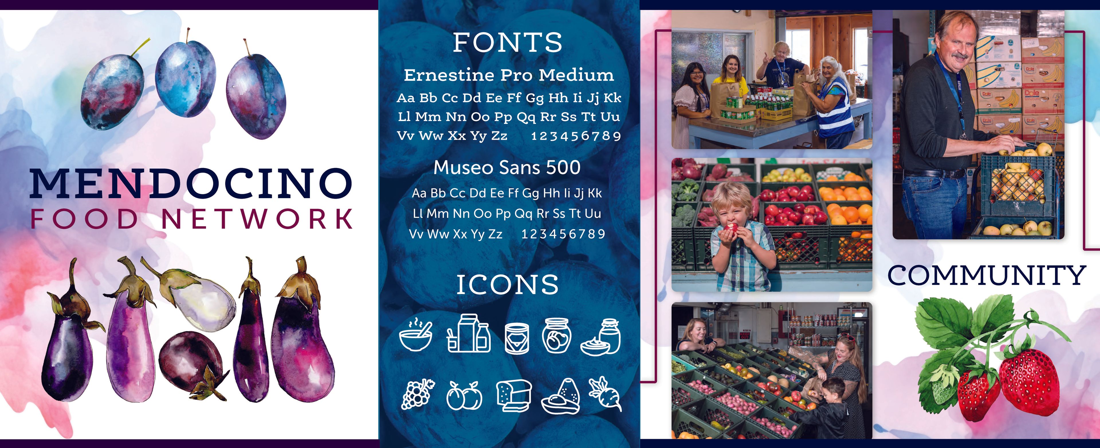
A stylescape is created before the actual design process begins. It is a carefully curated visual guide that captures the essence of a brand or project, including elements like colors, typography, images, and tone. This comprehensive reference helps communicate the overall look and feel that goes beyond individual design elements. It serves as the bridge between strategy and execution, combining design direction, brand architecture, and audience personas to influence the overall vision.
Our Journey with Stylescapes
We started incorporating stylescapes when we started working with clients who partnered with us for content strategy but struggled to articulate who they were or what they were trying to achieve. It became clear that these clients needed more than just content help; they needed a total brand realignment. Stylescapes emerged as a solution to help our clients understand their true identity and use their beliefs and values to guide their decisions.
Unique to Each Client
Design is not one-size-fits-all. Every client is unique with distinct needs, goals, and aesthetic sensibilities. By taking the time to understand each client's specific requirements, a stylescape ensures the end result resonates with the client. This preliminary step establishes trust, allowing everyone to express their ideas and collaborate towards a shared vision. It’s about creating a visual representation that speaks directly to the client’s brand identity and aspirations.
The Research and Strategy
What makes every stylescape unique is the research and strategy that precede its creation. Understanding the target audience, personality, and experience of each client ensures that the visual approach is tailored to their specific needs. This depth of preparation allows the stylescape to crystalize the client’s vision and expectations, setting the stage for successful design execution.
Streamlining the Design Process
One of the key benefits of a stylescape is its ability to streamline the design and decision-making process. Clients can quickly evaluate and provide feedback on the visual direction by comparing it to the stylescape, rather than spending time on lengthy revisions due to misaligned or miscommunicated visions. This efficiency is crucial in maintaining momentum and ensuring that design assets are heading in the right direction from the start.
Stylescapes vs. Mood Boards
While stylescapes and mood boards might seem similar, they serve different purposes. Mood boards are collections of inspirational images, offering a broad sense of aesthetic direction. Stylescapes take images from mood boards and arrange them into a functional layout that solidly defines the color palette, patterns, fonts and photos. Stylescapes are more curated and comprehensive, providing a clear and actionable visual plan.
We use stylescapes to begin logo design and branding projects with our clients, as well as websites for businesses that don't have a brand.
What project can we help you with? Call us today!


