Fort Bragg Food Bank
Providing nutritious food for a healthy and better life.
Fort Bragg Food Bank is a community resource, distributing food to those who need it most. They are a lifeline for many people, but felt their brand didn’t portray the vibrancy and hope of what they offer. We were tasked with bringing this buzz into their brand and to their web presence.
Scope
Brand Strategy, Collateral Design, Annual Reports, Signage, Web design, Booth Graphics
Brand Strategy
Building Around an Existing Legacy

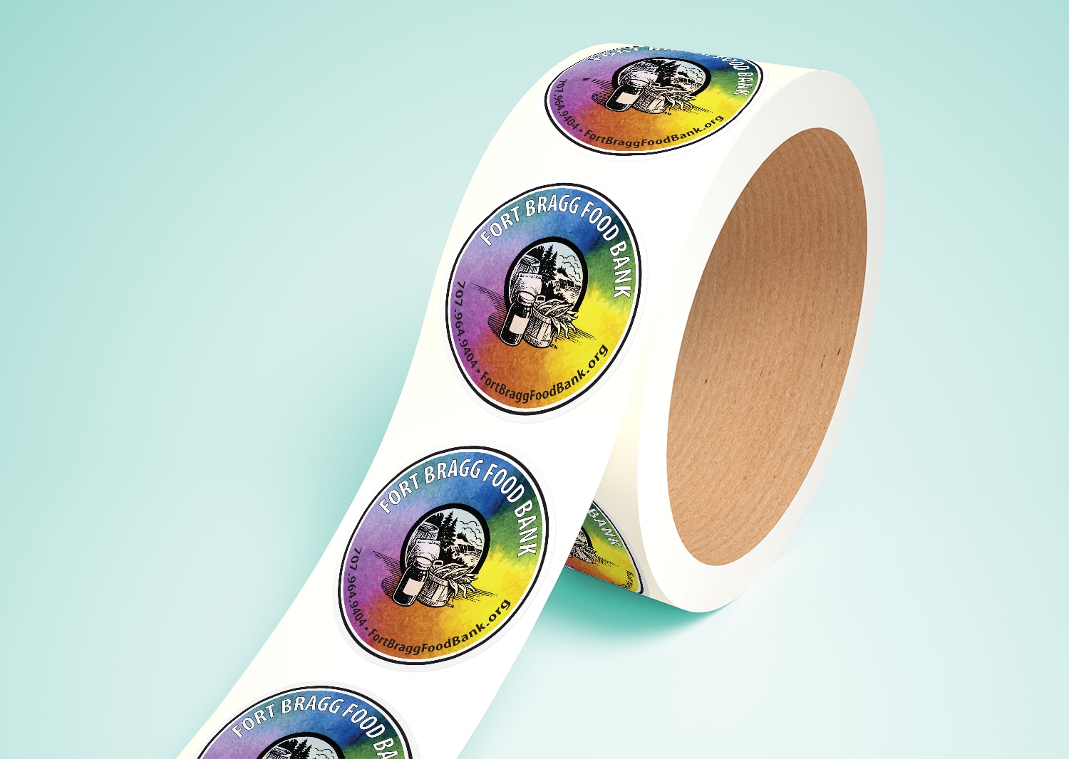
Their logo was designed nearly 30 years ago, and had an established and revered place in the community. This was a legacy they wanted to maintain. So, we created a bright palette and a luscious watercolor texture that added vibrant contrast to the clean, monochrome logo and splashed it across everything we did.
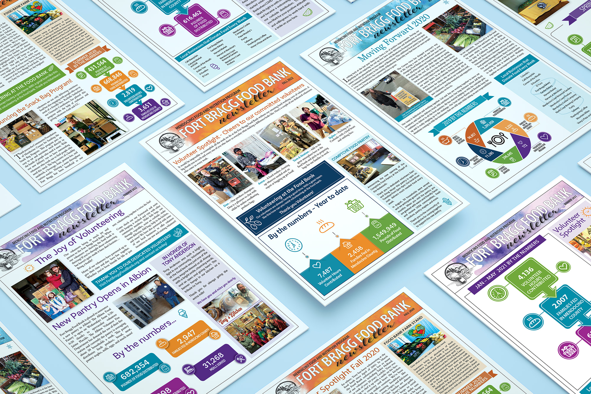
Newsletters
An inspirational message

The newsletter is the Food Bank's primary means of communicating directly with its members and the community. It showcases the organization's achievements in an inspiring and easily understandable format. With our extensive experience in print production, we were able to efficiently set up and print the newsletters, and mail them to the constituents. This made the process easy and hands-off for the busy Food Bank team.
The newly designed newsletter
increased donations by over
125%
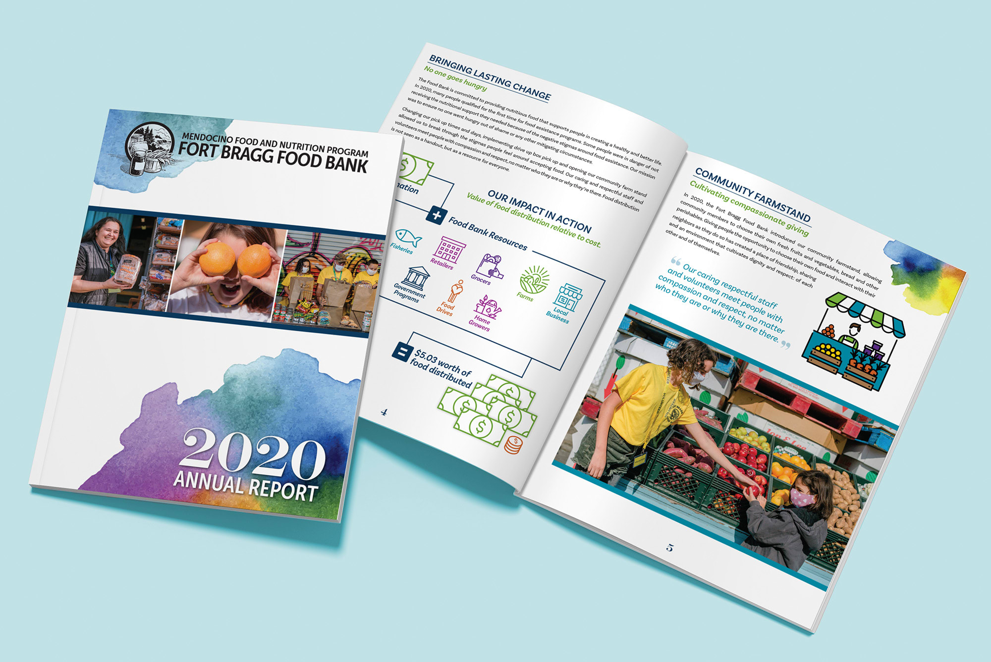
Annual Report
Sharing Community Contributions

Working closely with the Food Bank, we created a visually stunning and informative annual report that showcased the organization’s accomplishments and future goals. Our state-of-the-art printing technology made sure every detail was crisp and vibrant, leaving a lasting impression on stakeholders, donors and community members. The annual report was a powerful tool for the Food Bank to showcase their important work and inspire continued support.
Website
A clean, uncluttered user experience

The Food Bank’s website was sadly lacking modern appeal and used an outdated platform that was difficult to navigate. As a result, the organization’s essential information was buried deep in a maze of pages, making it difficult for visitors to find what they were looking for. Through our discovery process, we identified the information most important to their visitors and made sure it was easily accessible, creating a clean user experience with less to navigate. The website also made things easier for the Food Bank team. With an intuitive backend and a more streamlined presentation, they got less calls, spent less time fighting with updates and had more time for what they value most: their clients.
Collateral
Connecting with community in a tangible way
Marketing collateral like brochures, business cards and magnets allow the Food Bank to interact with the community on a personal level. These “leave-behinds” raise awareness of their mission and offerings, reminding potential donors, volunteers and supporters to interact with the brand. Eye catching designs and color palettes encourage people to keep these giveaways and strengthen the organizations connection with the community.

Marketing collateral like brochures, business cards and magnets allow the Food Bank to interact with the community on a personal level. These “leave-behinds” raise awareness of their mission and offerings, reminding potential donors, volunteers and supporters to interact with the brand. Eye catching designs and color palettes encourage people to keep these giveaways and strengthen the organizations connection with the community.

Infographic
Information at a glance

The Food Bank has multiple income streams and community programs, which can make it challenging to provide a clear and concise overview of its work. To address this, we created a colorful and easy-to-read graphic that summarizes their contributions to the community at a glance. The infographic helps the Food Bank's team to explain their mission and helps clients to understand the value of their contributions. This clarity has lead to an increase in donations, engagement, and emotional investment from donors, volunteers, and staff alike.
